
")
")
Accessible Evacuation Routes: Safety Signage for People with Reduced Mobility
Accessible Evacuation Signage: Safety is a Universal Right
Safety in a building is not a privilege — it is a universal right.
In the context of emergency signage, this means that evacuation routes must be safe and clear for everyone, regardless of their abilities. Beyond mere regulatory compliance, ensuring accessibility in these pathways demonstrates social responsibility, a cornerstone of modern corporate culture.
As experts in spatial signage, we understand that a successful evacuation depends on speed and clarity — and inclusion is the key to achieving it.
Beyond Legal Requirements: Leadership in Inclusion
Standards such as UNE 170001 on Universal Accessibility and guidelines from the Technical Building Code (CTE) provide the foundation. They establish minimum requirements to make buildings and urban spaces usable for all people.
However, leading companies go beyond the legal minimum. Investing in high-quality accessible signage not only prevents penalties and improves regulatory compliance, but also strengthens brand image and demonstrates a genuine commitment to the safety and wellbeing of every individual — employees, clients, or visitors alike.
The key is to adopt a universal design approach.
This means that signage solutions are not added as an afterthought but are integrated from the planning phase, ensuring they are functional and safe for everyone — including people with reduced mobility, visual or hearing impairments, and cognitive disabilities.
Pillars of Accessible Evacuation Signage
For an evacuation route to be truly accessible, signage must be multidimensional, communicating through multiple senses:
Visibility and Contrast:
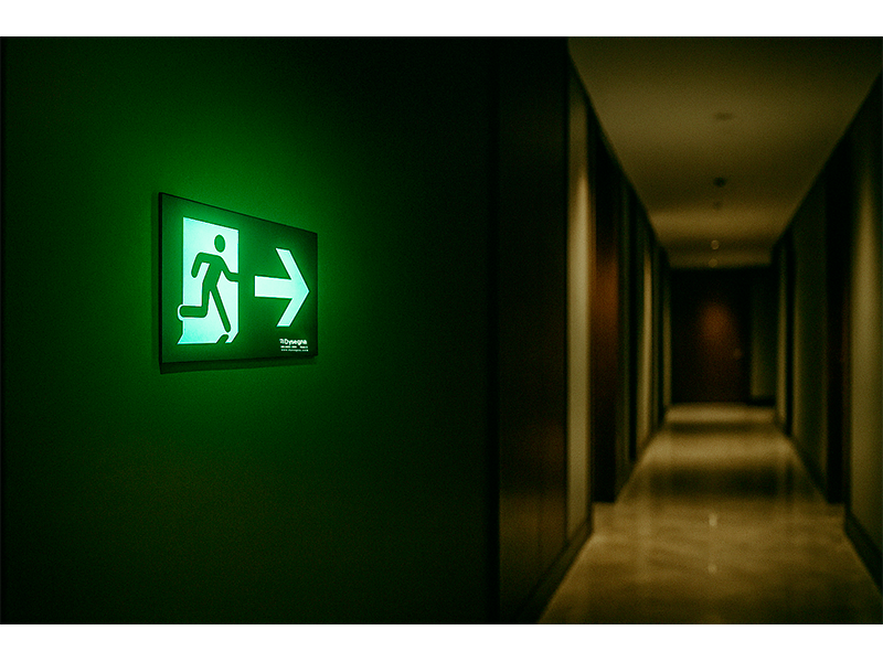
Emergency signs must be visible at all times. Photoluminescent signs are an industry standard, absorbing light and glowing in the dark to ensure the route remains visible during a power outage.
Additionally, color contrast between the symbol and background is crucial for people with low vision and must comply with standards such as UNE 23034:2023.
Universal Symbols:
The use of internationally recognized pictograms, such as the International Symbol of Accessibility (wheelchair icon), is essential.
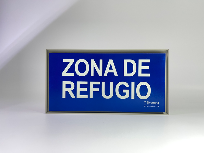
These symbols overcome language barriers and are understood by everyone. For evacuation routes, specific pictograms indicate safe refuge points or the presence of evacuation chairs for people unable to use stairs.
Tactile and Braille Information:
For people with visual impairments, tactile information is indispensable. Safety signs should include raised text and Braille, allowing users to read the information by touch.
The placement of these signs is just as important as the content; they should be at a standardized height and position for easy location, often near doors, handrails, and key decision points.
Tactile Guidance:
Podotactile floor signage, using raised strips and textures, is a modern technology that guides visually impaired individuals along evacuation routes.
These tactile paths, combined with warning tiles at changes in direction or before stairs, act as a sensory map that reduces disorientation in emergency situations.
Professional Installation: A Decisive Factor
High-quality signage is useless if it is not installed correctly.
The strategic placement of each sign is critical.
Signs must not only be positioned according to evacuation regulations but also at the correct height and in locations free of visual or physical obstacles.
A signage expert provides not just the products, but also guidance on evacuation plan layout and the implementation of an inclusive wayfinding system that ensures the safety of all.
Safety is non-negotiable.
By investing in accessible signage, companies not only protect people but also build a more inclusive future and demonstrate ethical leadership in their sector.
It is an investment in peace of mind and a brand image that values every individual.